Tableau connects to Tallyfy Analytics through Amazon Athena, letting teams build interactive…
Sample Tableau visualizations
Ready-to-use Tableau charts for Tallyfy data
Section titled “Ready-to-use Tableau charts for Tallyfy data”Here are 10 Tableau visualizations you can build from Tallyfy Analytics data. Each one answers specific business questions using your process, task, and form field data.
Time performance
Section titled “Time performance”1. Task on-time completion rates
Section titled “1. Task on-time completion rates”A pie chart breaking down tasks into on-time vs. late based on due dates and completion timestamps. It’s useful for quarterly reviews.
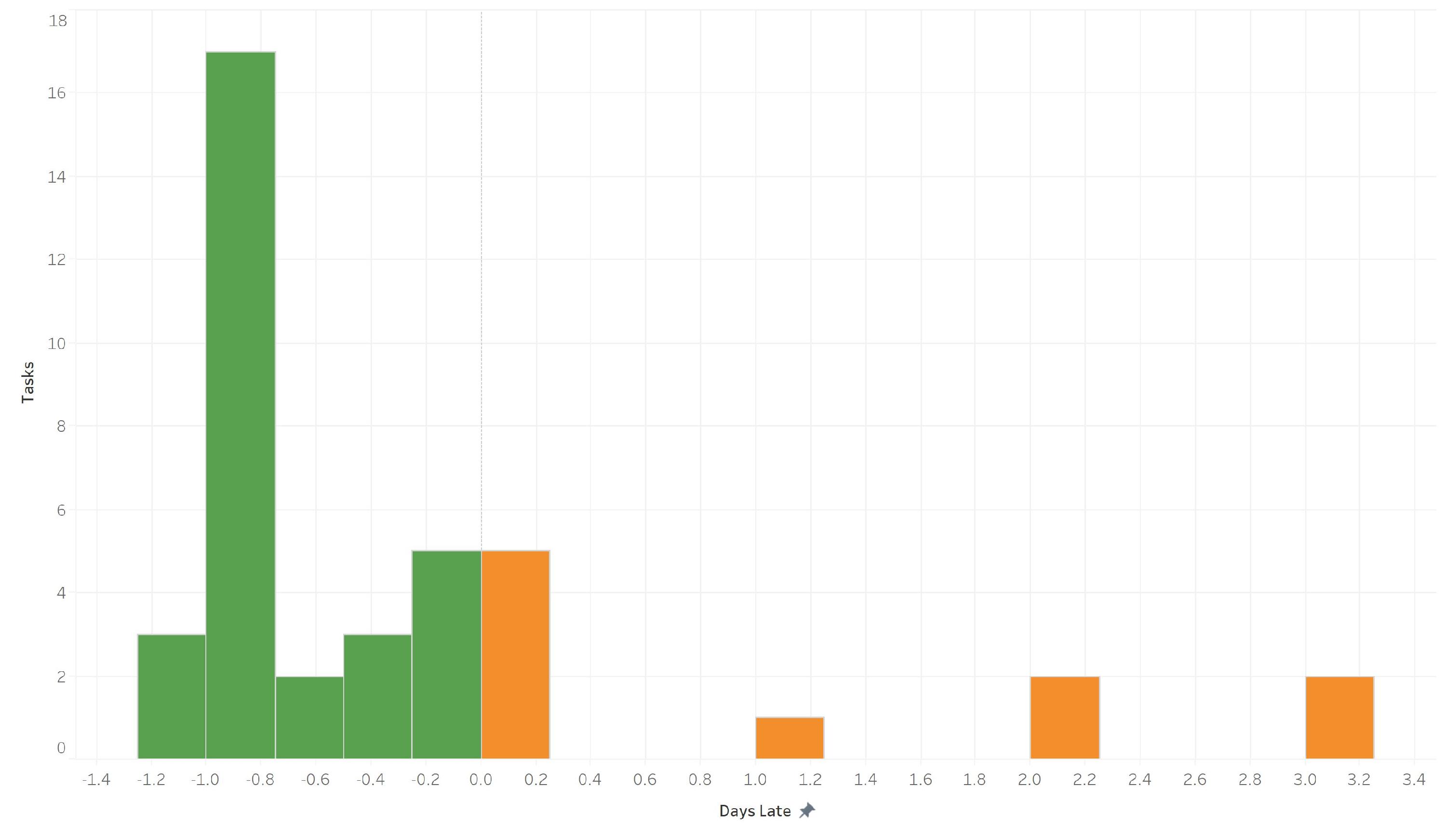
Questions this answers:
- What percentage of tasks finish on schedule?
- Are our due dates realistic?
2. User timeliness comparison
Section titled “2. User timeliness comparison”A bar chart comparing on-time rates across team members. Spot who consistently hits deadlines, and who might need support.
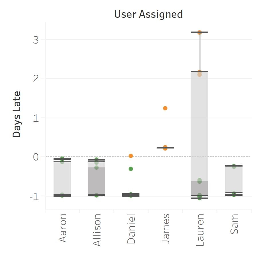
Questions this answers:
- Which team members meet deadlines most often?
- Who might benefit from workload adjustments or deadline changes?
3. Timeliness trend over time
Section titled “3. Timeliness trend over time”Track whether on-time completion is improving or declining week over week. It’s helpful for measuring the impact of process changes.
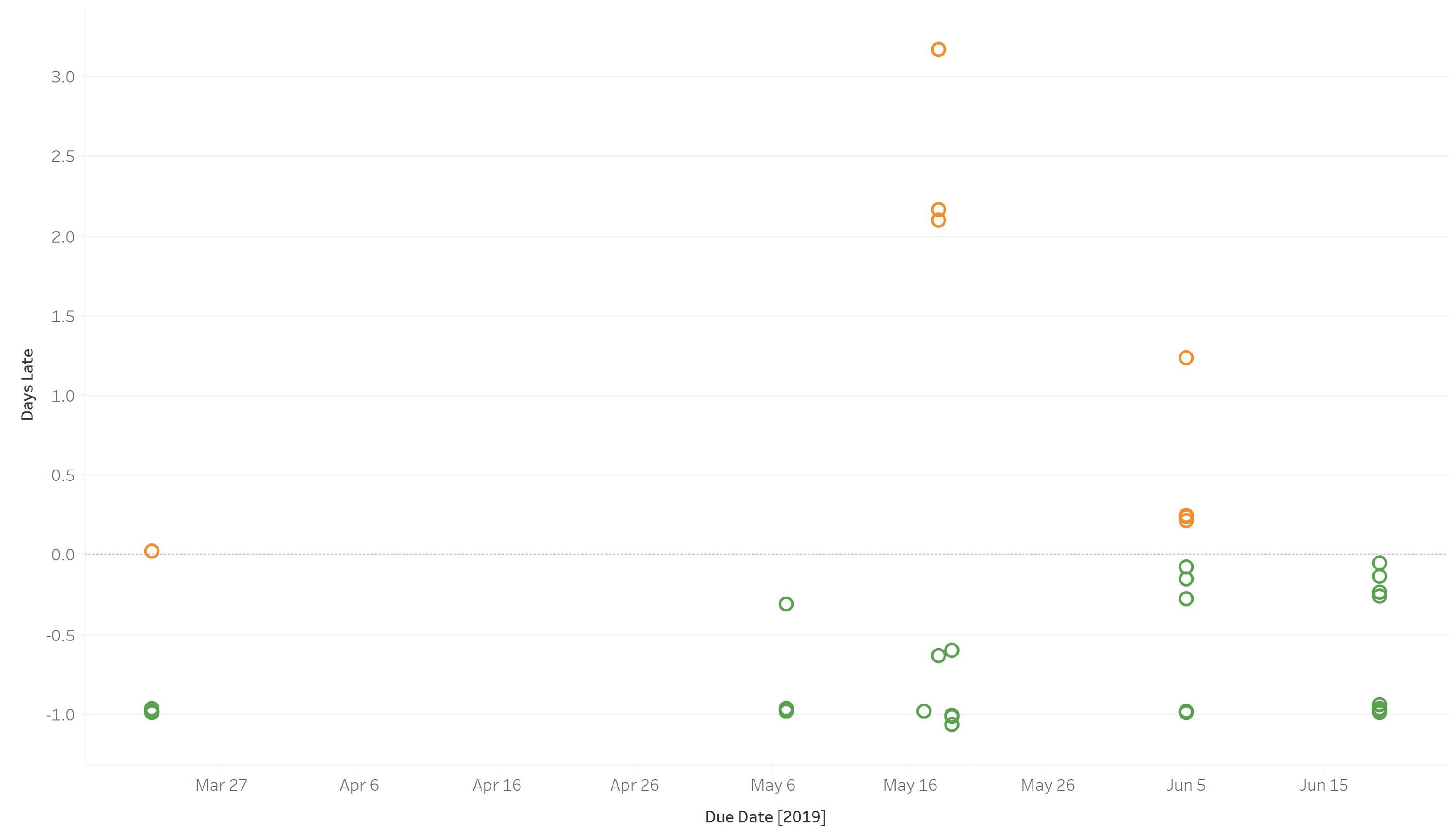
Questions this answers:
- Is timeliness trending up or down?
- Did a specific process change improve performance?
Workload and activity
Section titled “Workload and activity”4. Process ownership distribution
Section titled “4. Process ownership distribution”See how many processes each user owns. Quickly identify uneven workload distribution.
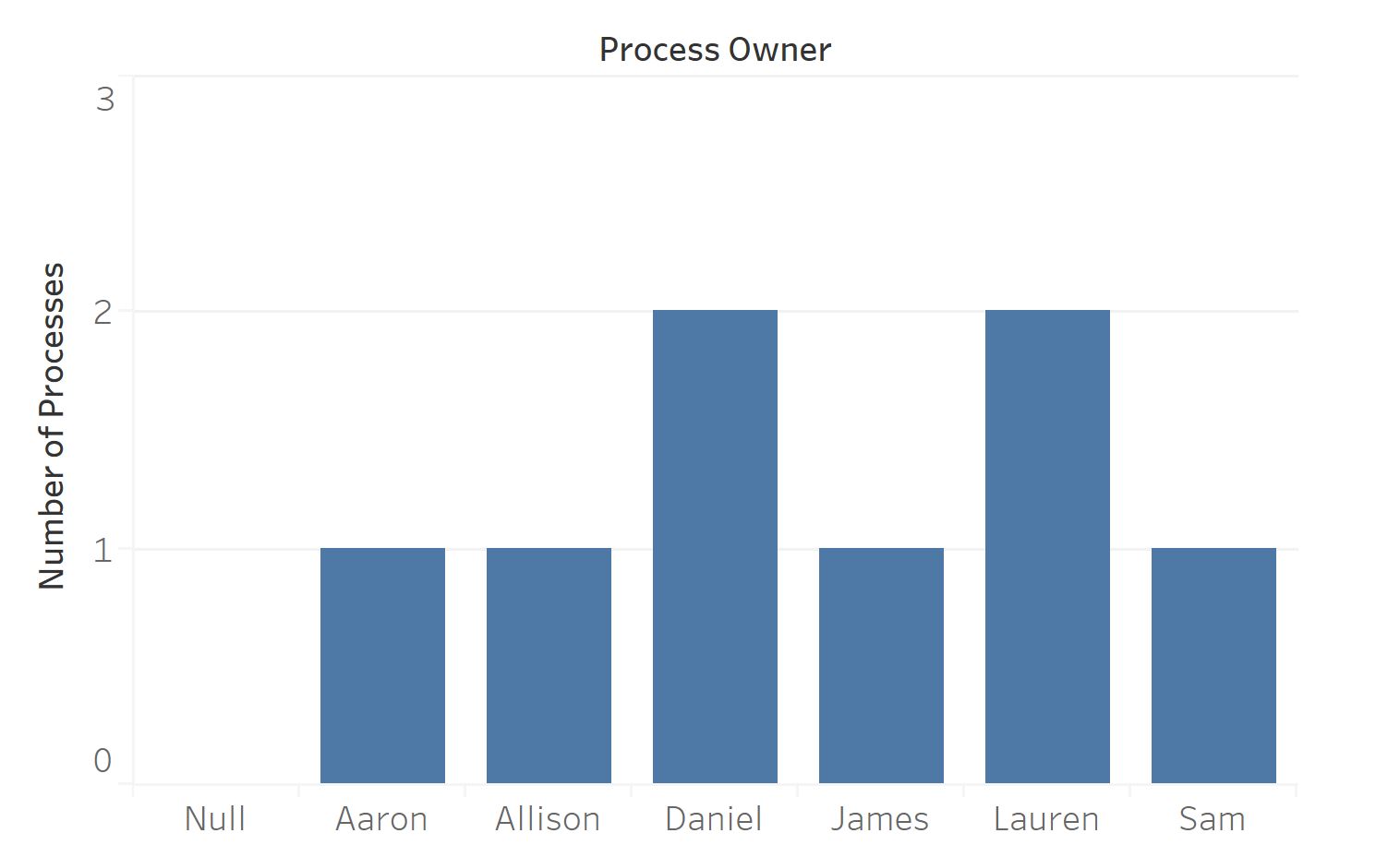
Questions this answers:
- Is process ownership balanced across the team?
- Are some users overloaded while others have capacity?
5. Task completion by user
Section titled “5. Task completion by user”Count completed tasks per person over any time period. It’s built from assignee and completion timestamp data.
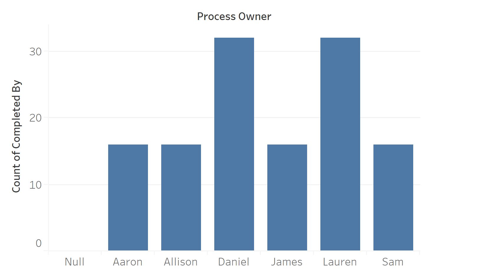
Questions this answers:
- Who completes the most tasks?
- Is workload distributed evenly?
6. Task-specific timeliness
Section titled “6. Task-specific timeliness”A heatmap showing which specific steps in your processes run late most often. Darker colors mean more delays. They’re the steps worth redesigning.
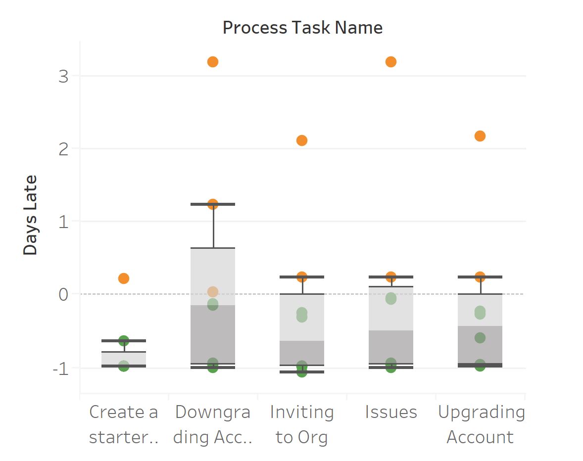
Questions this answers:
- Which steps consistently cause delays?
- Are there steps that need redesigning or clearer instructions?
7. Process template usage
Section titled “7. Process template usage”Shows how often each template gets launched. Identifies your most-used processes and templates that might be candidates for retirement.
Questions this answers:
- Which templates are launched most frequently?
- Are there templates that should be retired or consolidated?
8. Daily task completion activity
Section titled “8. Daily task completion activity”A time-series chart of daily task completions. Reveals patterns like Monday spikes or Friday slowdowns.
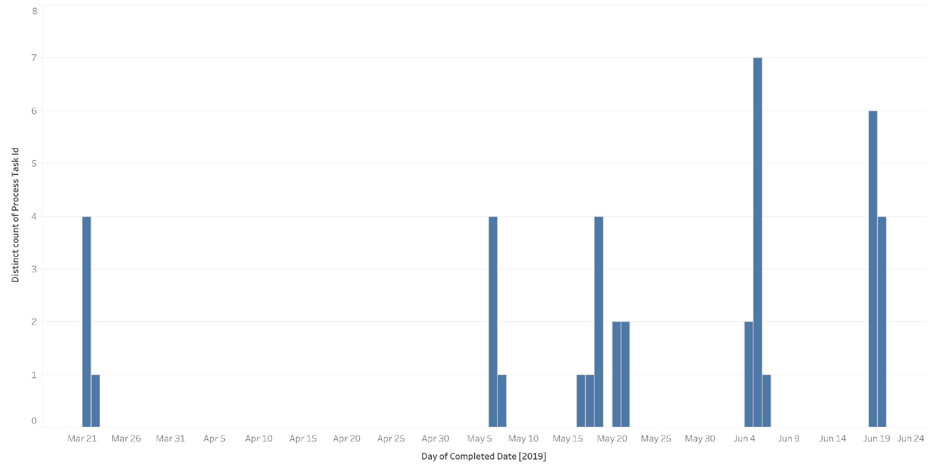
Questions this answers:
- Are there day-of-week patterns in task completion?
- Do we see consistent throughput or significant fluctuations?
Process quality
Section titled “Process quality”9. Comment frequency analysis
Section titled “9. Comment frequency analysis”High comment volume on specific tasks usually signals confusion. This chart pinpoints which steps generate the most discussion.
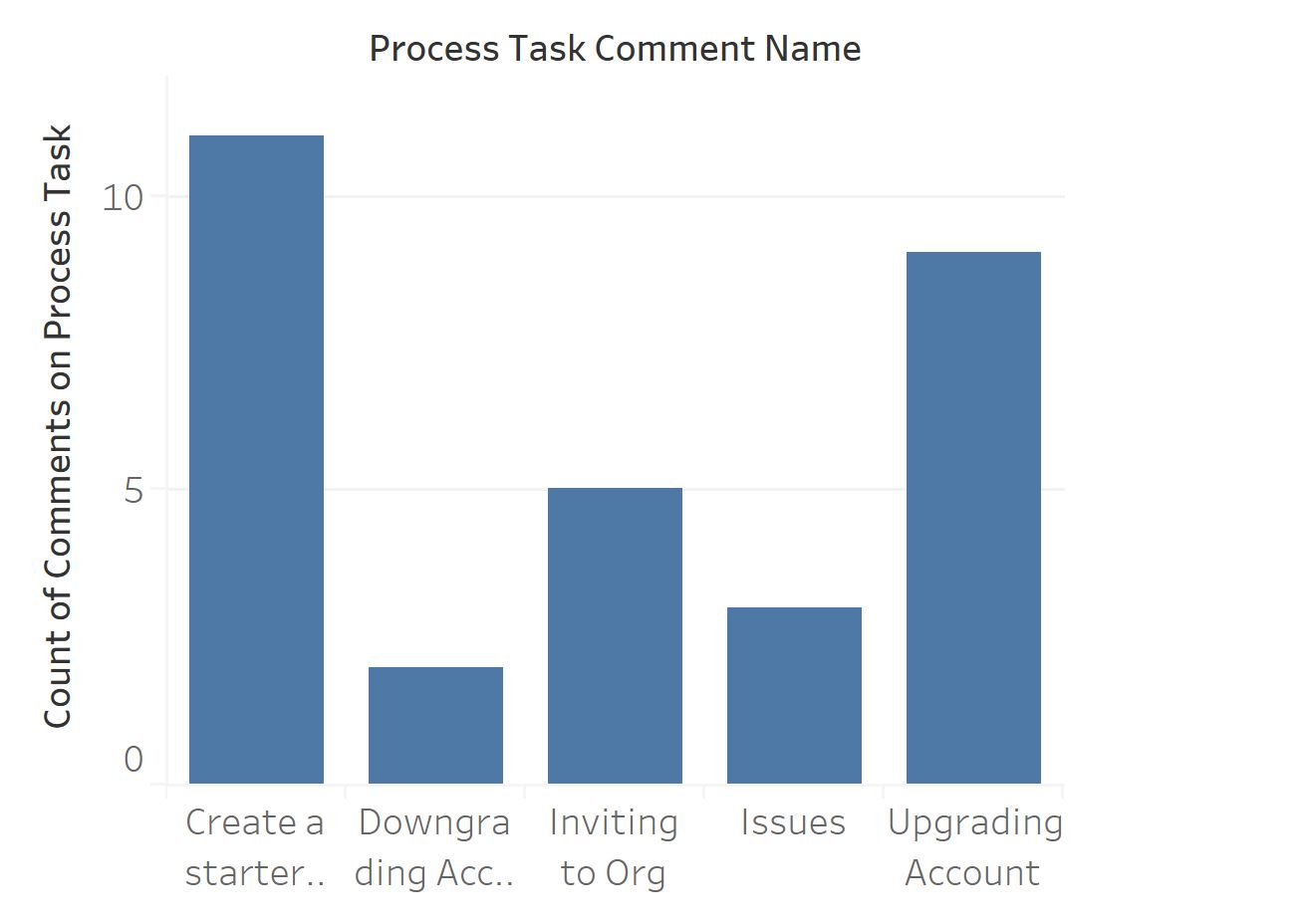
Questions this answers:
- Which tasks need the most clarification?
- Where should you improve step instructions or documentation?
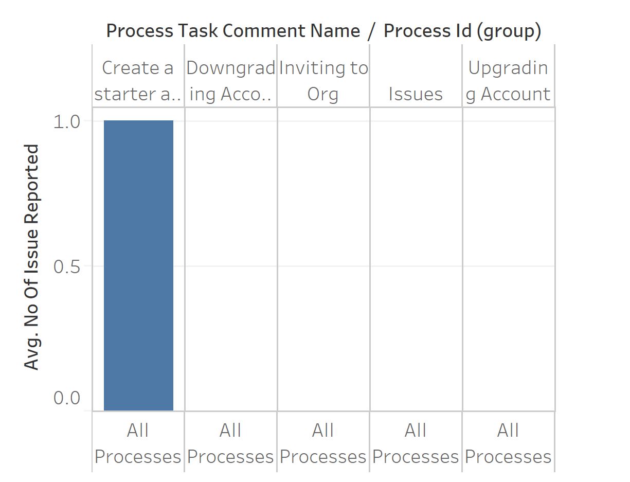
10. Issue frequency by task
Section titled “10. Issue frequency by task”Ranks tasks by how often they generate reported issues. Fix the top offenders first for the biggest improvement.
Questions this answers:
- Which tasks consistently produce problems?
- Where should process improvement efforts focus first?
Download the sample workbook
Section titled “Download the sample workbook”Get started quickly by downloading a pre-built Tableau workbook:
- Download the sample Tableau workbook ↗
- Open it in Tableau Desktop
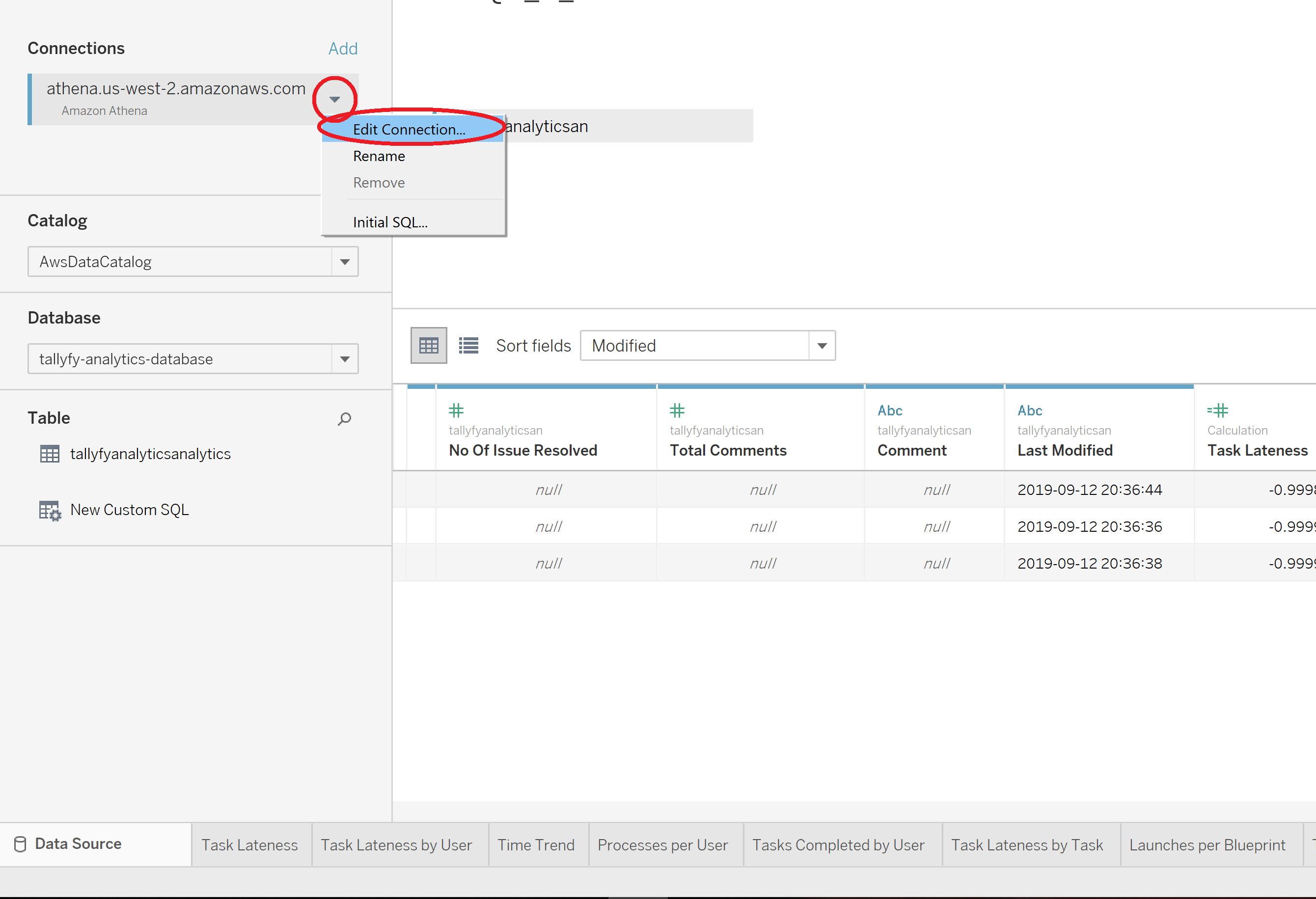
- Click Edit Connection and enter your own connection details. You will need the Athena server endpoint, the S3 staging directory, and the access key that Tallyfy provided you. Connecting Tableau to your Tallyfy data walks through every field.
- Customize the visualizations for your needs
These 10 charts are starting points. Once you’ve connected to Tallyfy Analytics, you can build custom views for any question your workflow data can answer.
Related articles
Section titled “Related articles”Process Improvement > Gather data and use Tallyfy Analytics
Good process improvement runs on real data, not assumptions. Tallyfy Analytics captures task…
Tableau > Connecting Tableau to analytics data
Tallyfy Analytics connects to Tableau Desktop through Amazon Athena in about 15 minutes. Install…
Process Improvement > Understand process flow without flowcharts
Tallyfy replaces static flowcharts with live sequential templates where each step has clear…
About Tallyfy